Brief summary.
For this brief I have been tasked with....
Initial ideas.
I initially started my ideas with a walk. I wanted to see what I could find using what was around me and being honest I really struggled. I was optimistic at first but unless I arranged twigs myself to create the letters I found it difficult to find them naturally occurring enough to make an entire font.

Alphabetti spaghetti!

|

For whatever reasoning the first thing to pop into my head when this module was set was spaghetti. It was easy to get my hands on and not surprisingly easy to mould into shapes.
|


Continuing with my initial idea of using food textures to create a font, I decided on crushing up a gingernut and making letters from it! I am very happy with how this turned out although I am even happier with my edits. I inverted the colours and low and behold, space dust! Even the crumbs look like little stars and I love it, I really want to take this further with photography and editing to possibly create a space themed font.
Ginger nut! biscuit moon!

|

|
Flour testing.
To continue with my theme of using stuff from the cupboards to create lettering, I decided to use flour. I used dry flour first but then added water and cake crumbs to the mix to try and create more texture. I had to add food colouring to make it visible on the page and I regret using red as it looks a little gross! The edits look much better though once I change the colouring.


Unfortunately these remind me more of germs rather than space and so i'm not sure this avenue is a good one to carry on with.
Plastic bags.


I wanted to try something completely different with this as it wasn't me placing the object but more moulding something that was already there. Although I like how the plastic bags ended up looking I don't think it would be an amazing avenue to go down as it was difficult to make each letter and i'm not sure they are that easy to read alone.
Hamster bedding


This is by far my favourite type yet. Although I made this out of hamster bedding once I edited it to become black and white negatives it looks more floral and leaf like. I love this look.
Final idea development.
I decided to go with the hamster bedding as it is my absolute favourite texture out of what I tried. I wanted to push this further however by testing it with different fonts as the base. in my initial test I placed the bedding to make letters with no real reference, I feel the font could look much stronger if i base it off of already existing digital fonts.

|

|


|

|


|

|


As I couldn't decide which font I preferred I asked my peers and friends to vote on one and this was the result.
FIVE VOTES ONE VOTE THREE VOTES
Gabriola has won the vote and therefore I will take this further next to create my alphabet.
Final alphabet.


Final presentation.
Named lovingly after my hamster, here is my final presentation, Bedded Parsnip!

Workshops
My 'typography selfie'
I was set the challenge of creating a 'typography selfie' in my first lecture on this module. I had about 45 minutes to find a font I liked and to embellish a letter from it with things i found represented myself.

This font 'Red Bee' from dafont stood out to me so I decided to go with that. I also liked how the title fit with my theme, I decided to make mine about a 'busy bee' as I felt this described myself pretty well. I filled my letter with sunflowers, a cat and the night sky as these are a few of my favorite things, then of course the busy bee whizzing through the letter.
|

|
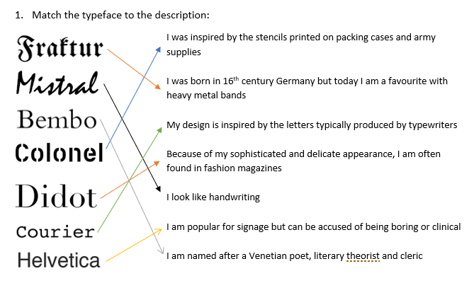
Type quiz !


Ampersands workshop!
Bathroom.


|
I had a lot of fun decorating this Ampersand. I wanted to use negative space rather than embellish the ampersand itself so I used masking fluid to cover the letter then mixed paint with washing up liquid and a little water to create bubbles! I thought this fit in with my bathroom theme well and I really enjoy the fun outcome.
|
Garden.


|
I wanted to make this ampersand a little different also.
I achieved this by using a dip pen and not adding colour, both things I don't do very often at all! I love how busy it looks although if I was to do this again I might add some shading with ink to help differentiate between the flowers and grass. |
Pets.

|
There wasn't much to document with this ampersand as I just drew it with markers.
Italics always remind me of the Z's you would find next to sleepy characters in kids books and so I decided to draw the 'pets' cuddling the ampersand. I think this concept is cute and, although it could have been produced with a little more detail, looks good. |
Silly saying.
For this task I had to pick one of the silly sayings provided and create a hand rendered piece. I first started with my own handwriting, then i began to play with arrows to help the message come across.


|


|


